P3 Paddle Zone
Launching a fitness business in a new collaborative space
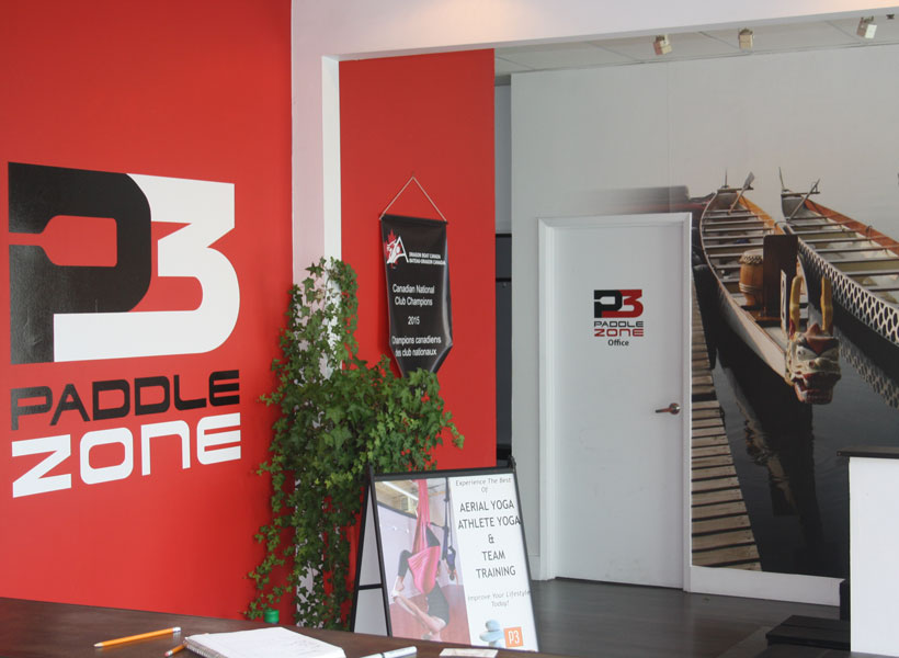
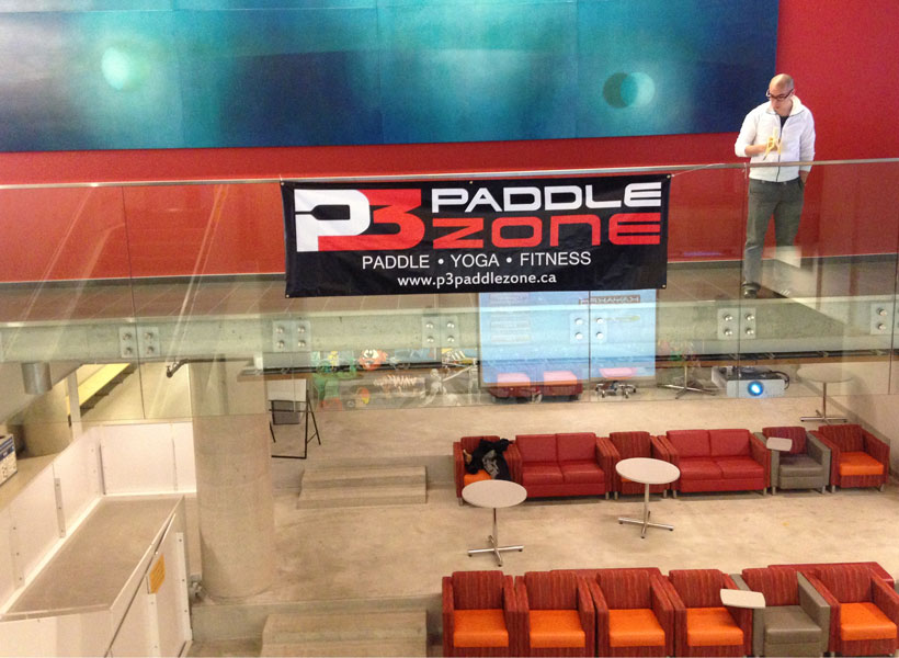
P3 Paddle Zone includes a fitness centre, group training, paddling ergometres, and a yoga studio.
The term Cetacean refers to marine mammals: consider dolphins and whales with a high level of intelligence and the ability to communicate over long distances.
The project
A logo and website were needed to brand the new space and establish a solid visual identity.
- A logo, with orientation and colour variations
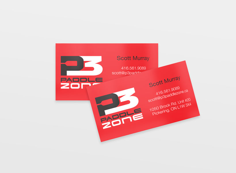
- Business Cards
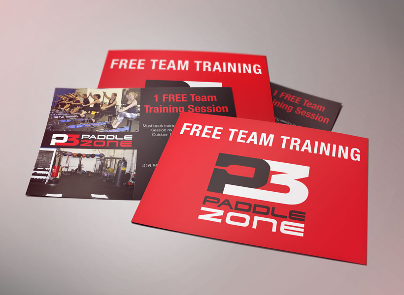
- Promo Flyers & postcards
- Responsive website bringing together the different 'zones'
Bold, black and red fit with this business’s strong athletic focus. The text is confident, friendly and approachable. The negative space of the P forms a paddle, adding a cool visual element and further connection to the sport. Credit goes to the wonderful Jen Chen for the original paddle-P concept. I developed her idea further by refining the P3 shape, changing the colour, and aligning and customizing the type. The logo has variations for horizontal and vertical use, as well as a dark or light background.
The website gives emphasis to photos, is easy to browse through and read, and is responsive for mobile screens. Visit the site at p3paddlezone.ca