Green Door Decor
Branding for a new event decor business
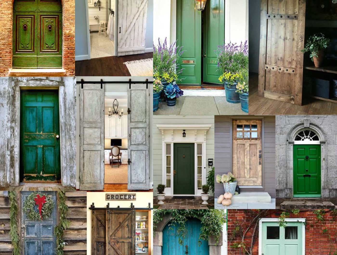

The Inspiration
An event decoration and rental business, located in Simcoe County.
Green Door Decor sources unique and hard-to-find items to help bring an event's theme to life. Rustic, vintage and authentic items are what helps define the company vision and aesthetic.
The Project
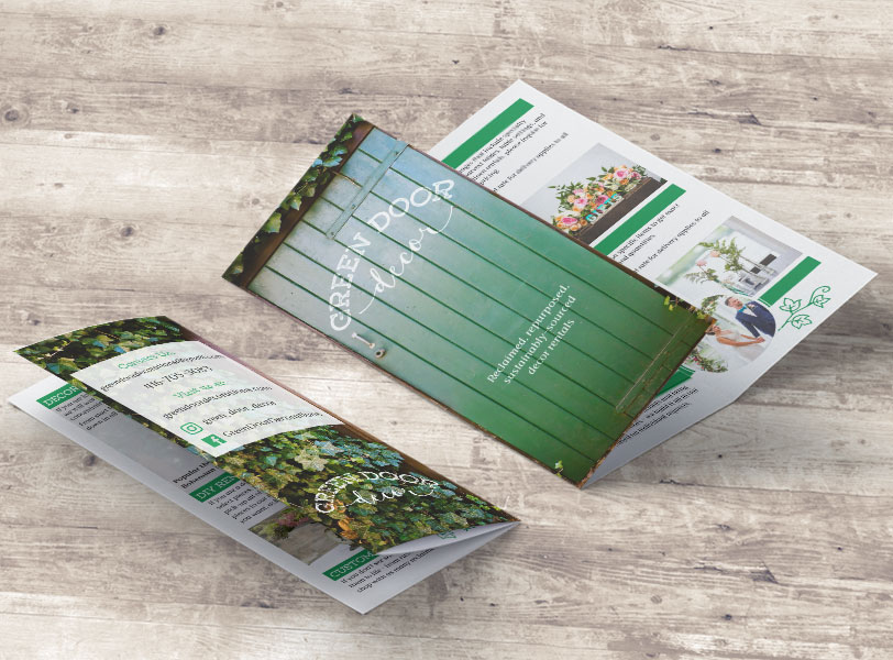
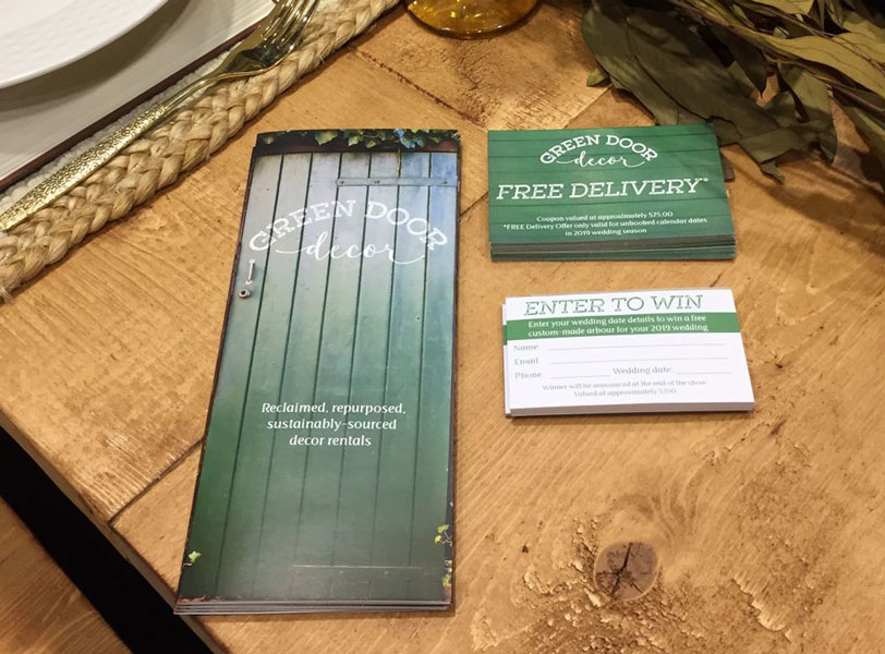
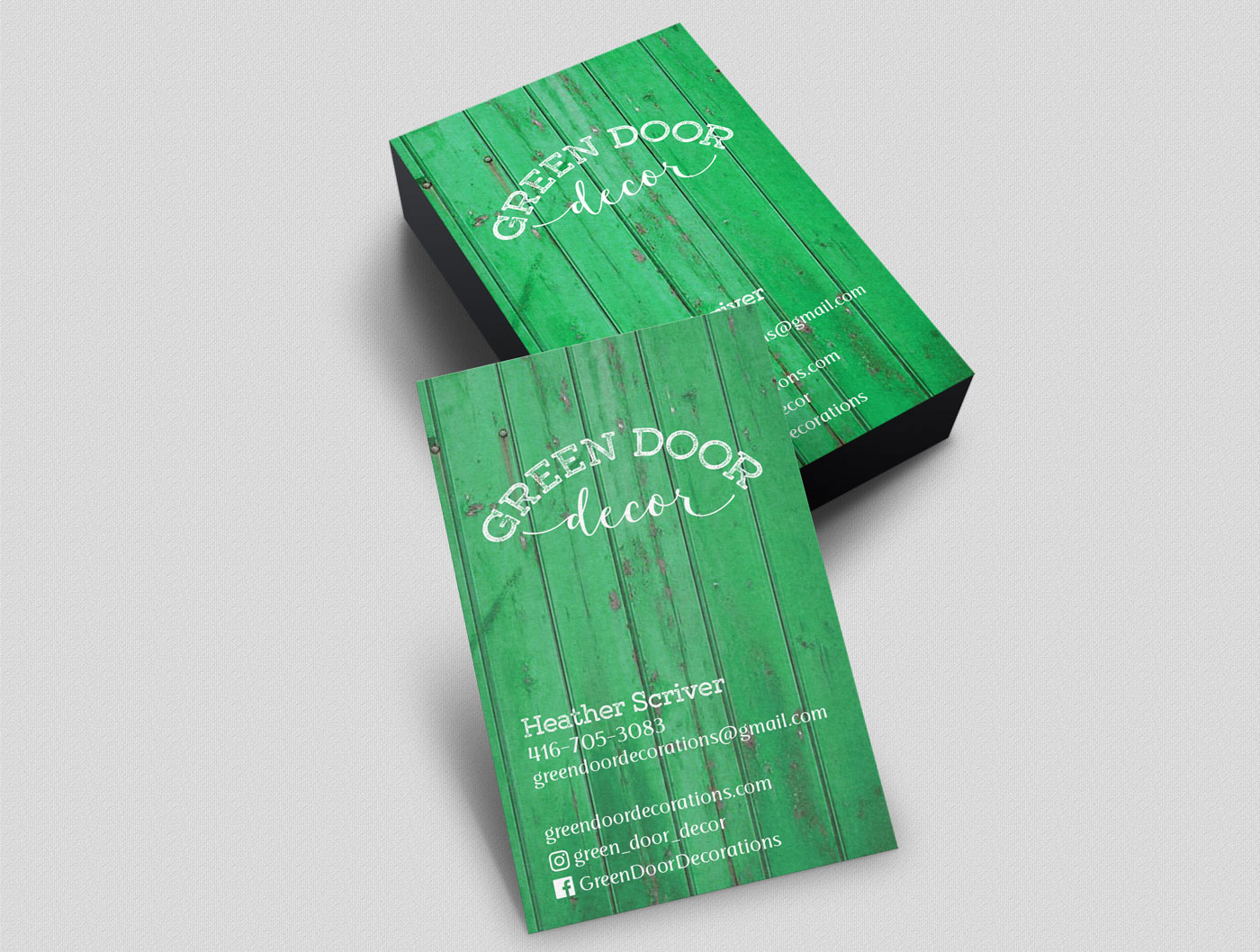
The visual brand needed to convey this rustic, one-of-a-kind feel. To achieve this, a distressed font was used in combination with a handwritten script. The effect is a bit like a stamp.
While the textured font is important in the overall distressed feel, the shape of the logo is really what defines this brand. The curve of the text brings to mind an arched doorway window. With this arch shape, the logo fits perfectly over a background texture or door. This is seen on the door-like business cards, the background image on the client's website, as well as being stencilled on a real door as a display item.