Big Rock Bouldering
Branding a new bouldering gym in Okotoks
The Inspiration
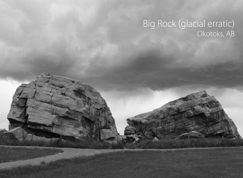
The name "Big Rock" refers to the Okotoks Erratic, an enormous rock transported far from its place of origin by glacial ice. It is a 16,500-tonne boulder that lies on an otherwise flat landscape in the Foothills region of Alberta.
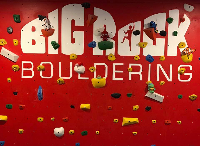
The logo takes its distinctive shape from this boulder, and is instantly recognizable to those in the area.
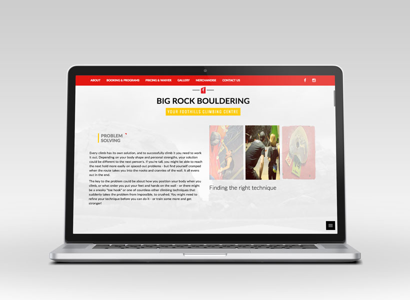
The project
A logo and website were needed to brand the new space and establish a solid visual identity.
- The logo
- Business Cards
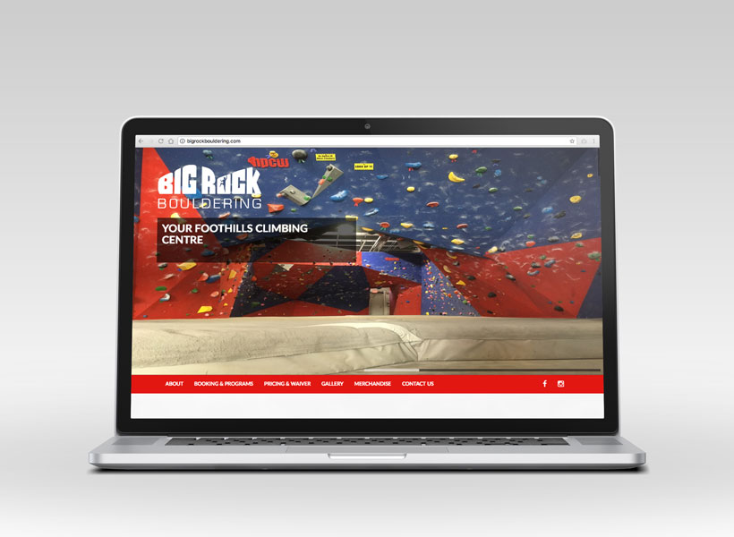
- Full website showcasing the gym and providing climbing information
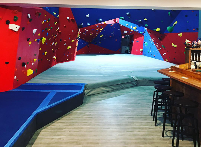
Bold and solid, the logo shows strength and personality. It's versatile over top of images, on dark and light backgrounds. The white (or black) logo allows it to stand out among the colourful walls and climbing holds in the gym.
The website gives emphasis to photos, is easy to browse through and read, and is responsive for mobile screens. Visit the site at bigrockbouldering.com